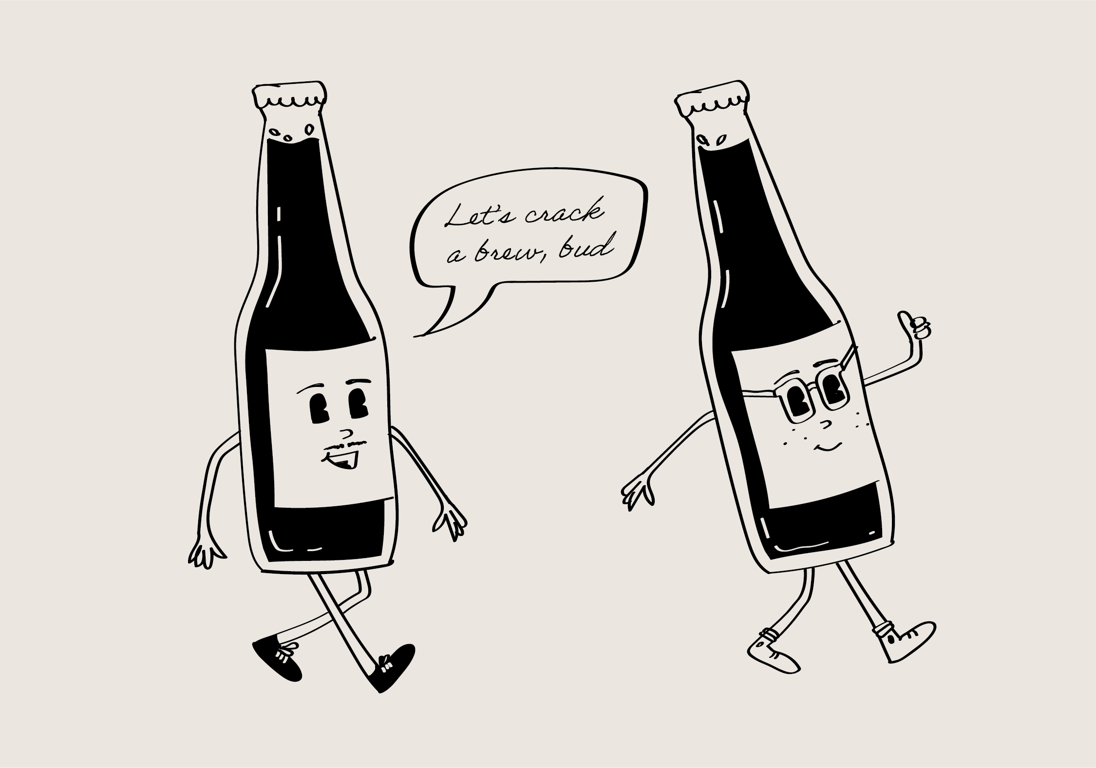
Bobcat Brew Collaboration
The process of designing the identity and packaging for Bobcat Brew, a Toronto-based microbrewery.
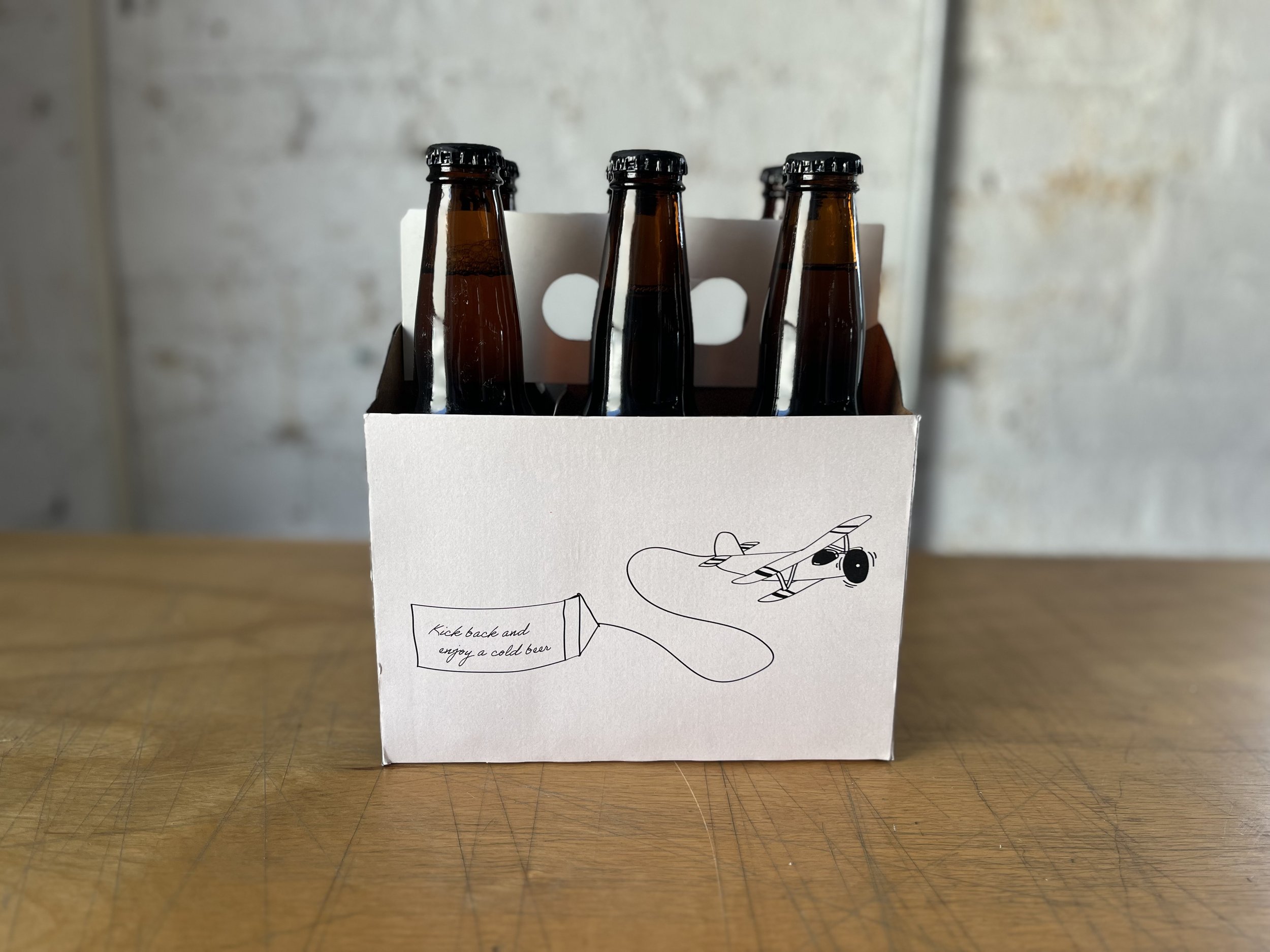
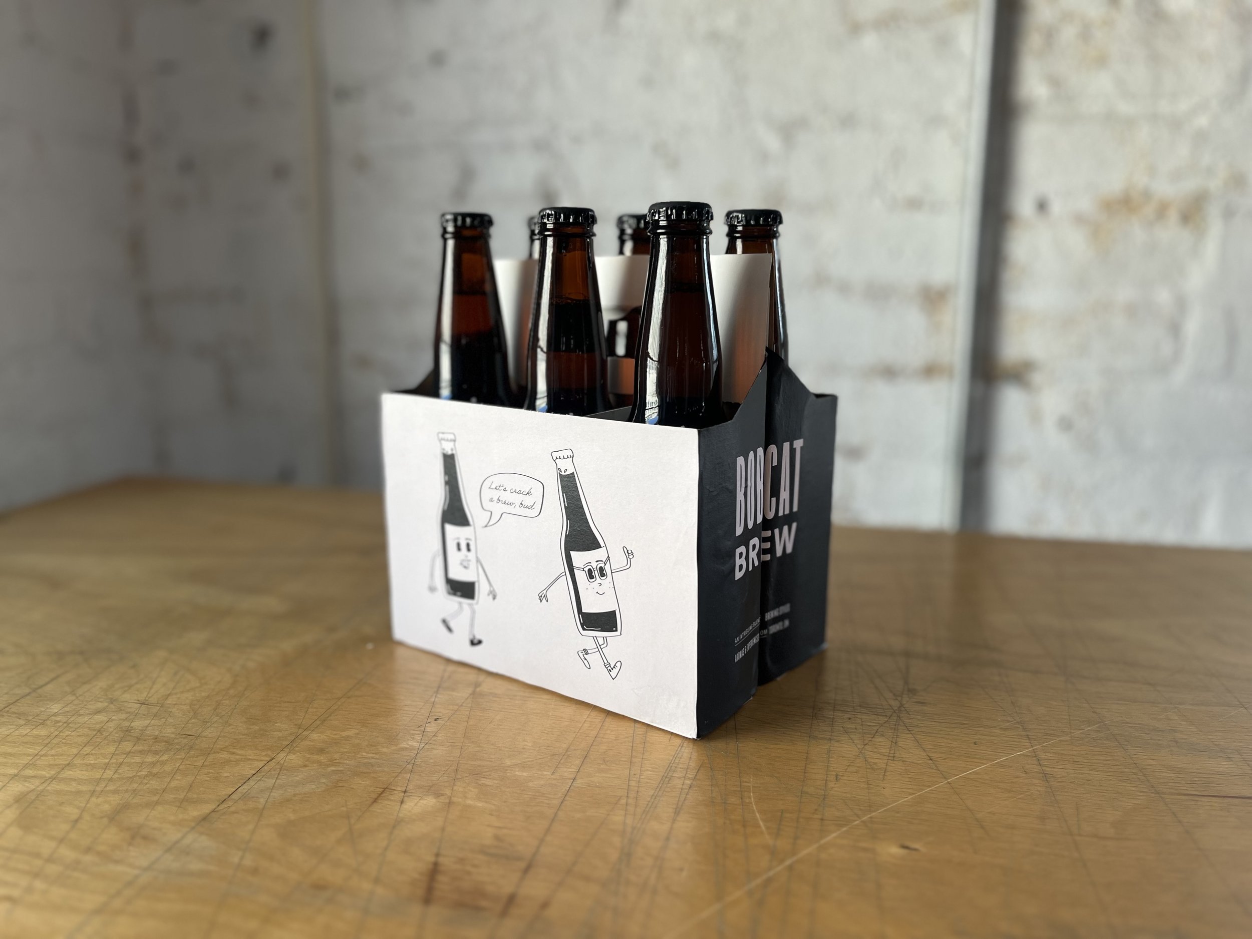
Bobcat Brew sought to establish a compelling brand identity and eye-catching packaging design that would resonate with its target audience and encapsulate the essence of its craft. This case study presents the design process journey undertaken to achieve this goal, aligning with the brewery's vision and values.
CLIENT’S VISION AND REQUIREMENTS
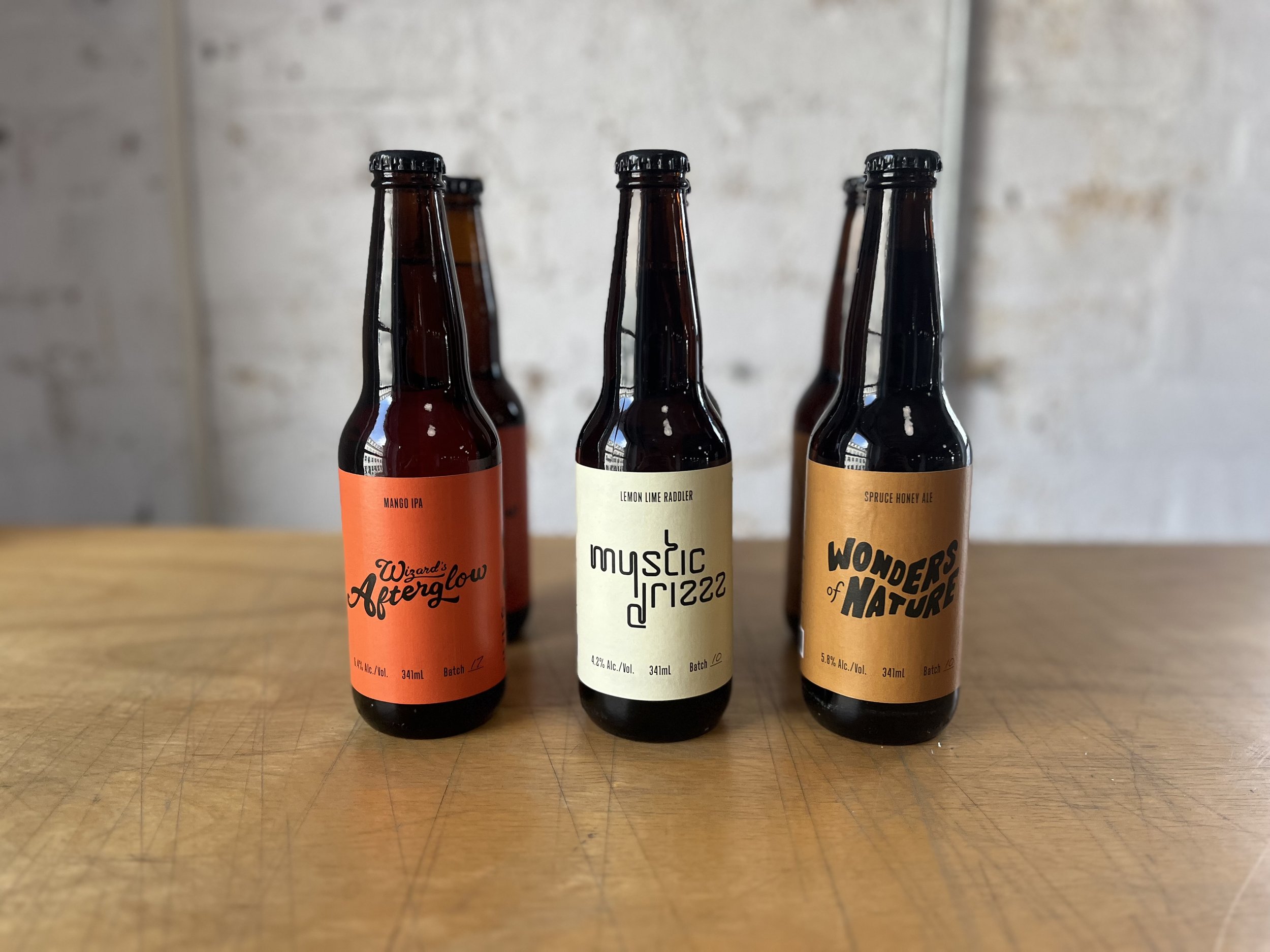
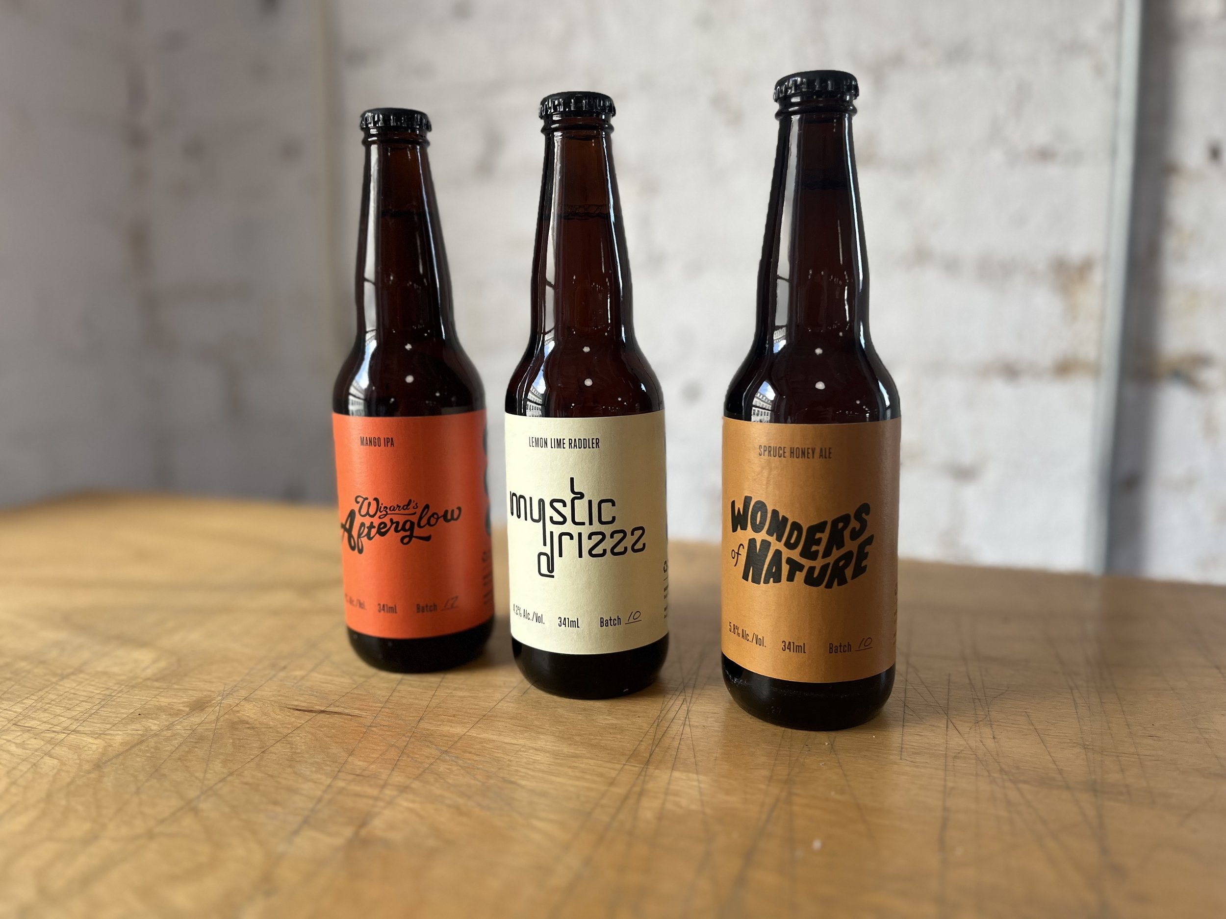
Bobcat Brew envisioned a brand identity and packaging design that harmonized with its core values of quality, craftsmanship, and the fusion of a vintage aesthetic with the vibrant energy of nature. The objective was to create a design that stood out in a competitive market while paying homage to nostalgic elements, drawing on simple line work, bold typography, and vintage colours.
PROCESS
CONCEPT DEVELOPMENT
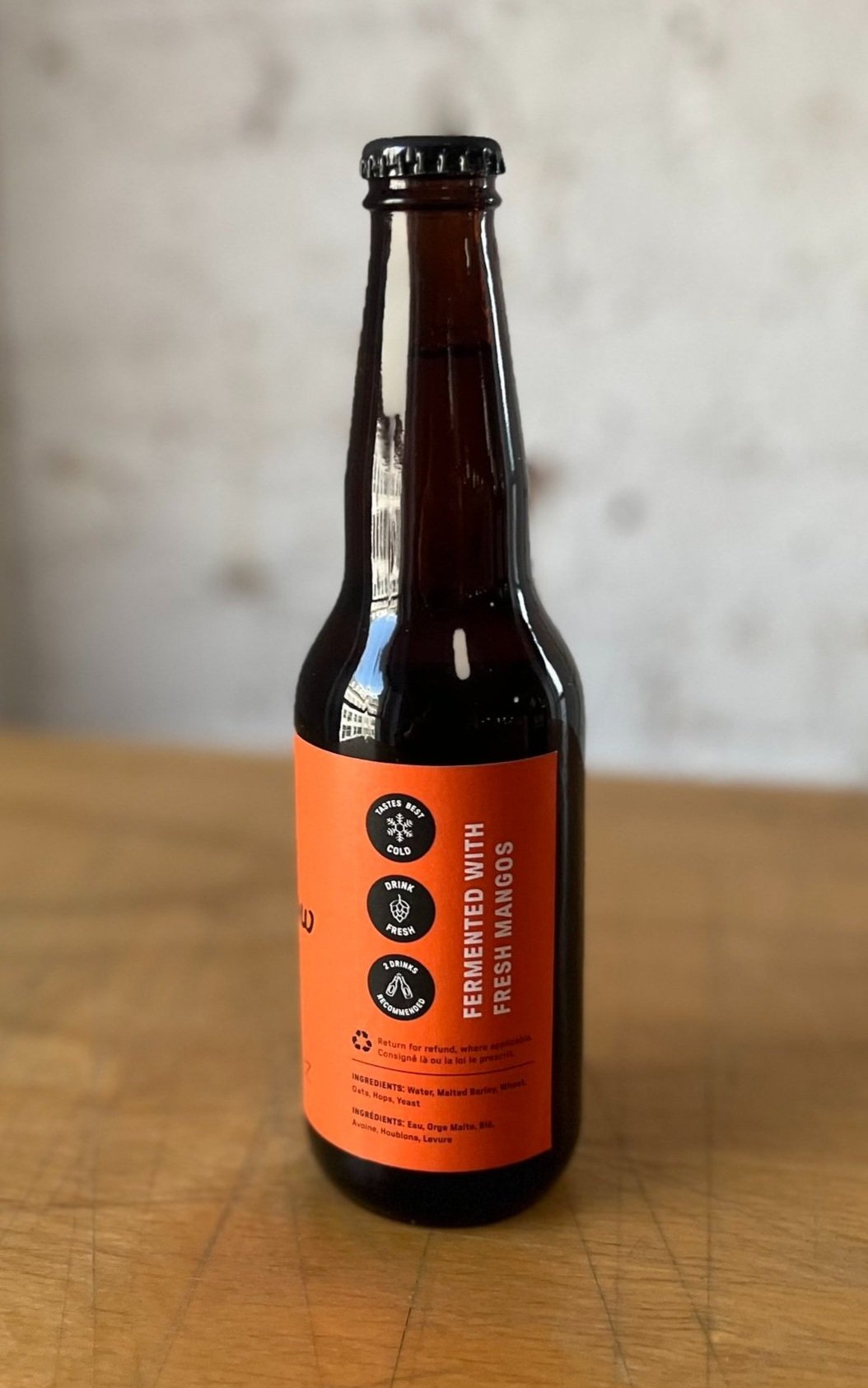
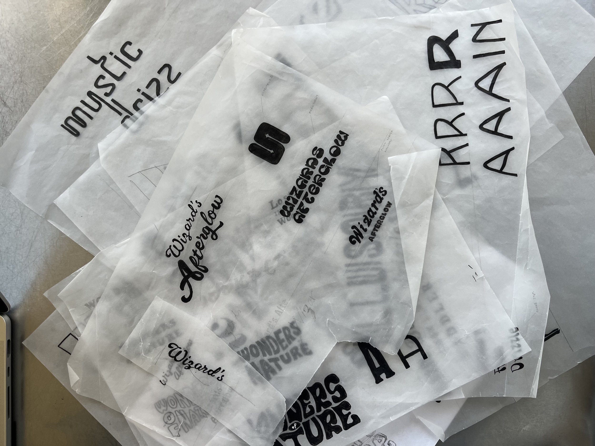
Typography was pivotal in the design, aiming for a perfect balance between vintage and contemporary. Existing typefaces were modified and custom-designed, drawing inspiration from reputable typographic resources. Although hand lettering was not initially required, it quickly became a key component, adding a personalized touch and enhancing the brand’s unique identity. Incorporating simple icons proved to be an effective strategy, providing an additional visual element that enhanced the overall design. These icons not only serve a functional purpose, aiding in conveying product information but also add to the visual appeal of the packaging.
BRANDING
COLOUR PALETTE

